BURST YOUR BUBBLE: BIPARTISAN NEWS AGGREGATION APP
How might we help millennials better communicate with those who have opposing political views?
PROBLEM
The 2016 US Presidential Election was one of the most polarized elections to date. Even though the American public is more connected than ever in the age of social media, the citizens still live in sharply contrasted echo chambers. How might we better communicate with those who have differing political views?
SOLUTION
Burst Your Bubble is a news aggregation app that displays news articles on major political issues. Based on the user's regular reading habits, the app will provide an opposing news source to help the user better empathize with those who have opposing views.
Scope: 6 weeks
Categories: UX Research, UX Design
Role: Solo project. Conducted user interviews, created wireframes and prototypes
Tools: Sketch, Princple, Omnigraffle
The Solution
Recommendations
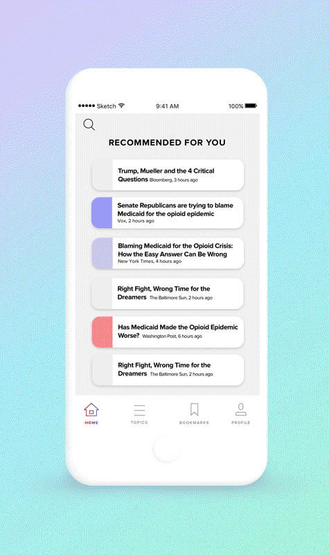
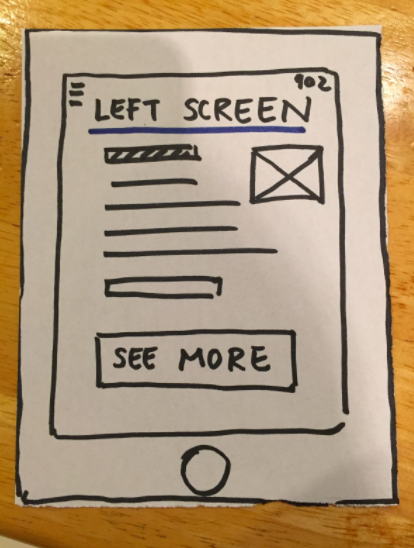
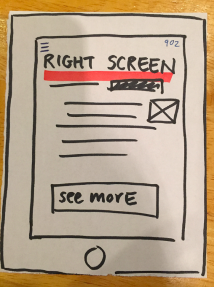
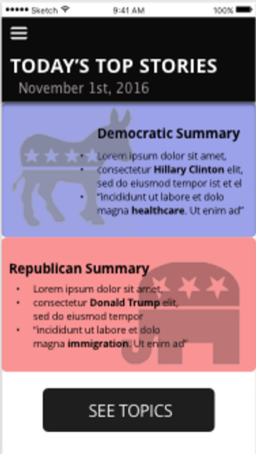
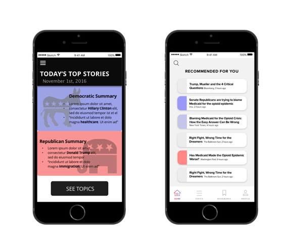
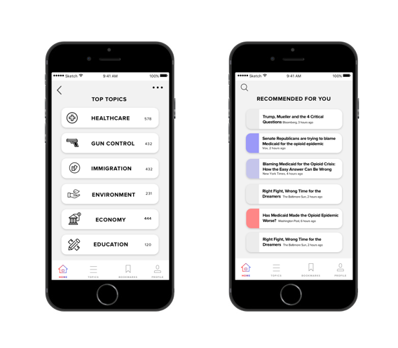
Upon entering the application, you will be given a feed of recommended articles. Unlike other social media feeds, which use algorithms to show you what you want to see, the application will give you a mix of articles from a variety of different sources across the political spectrum.
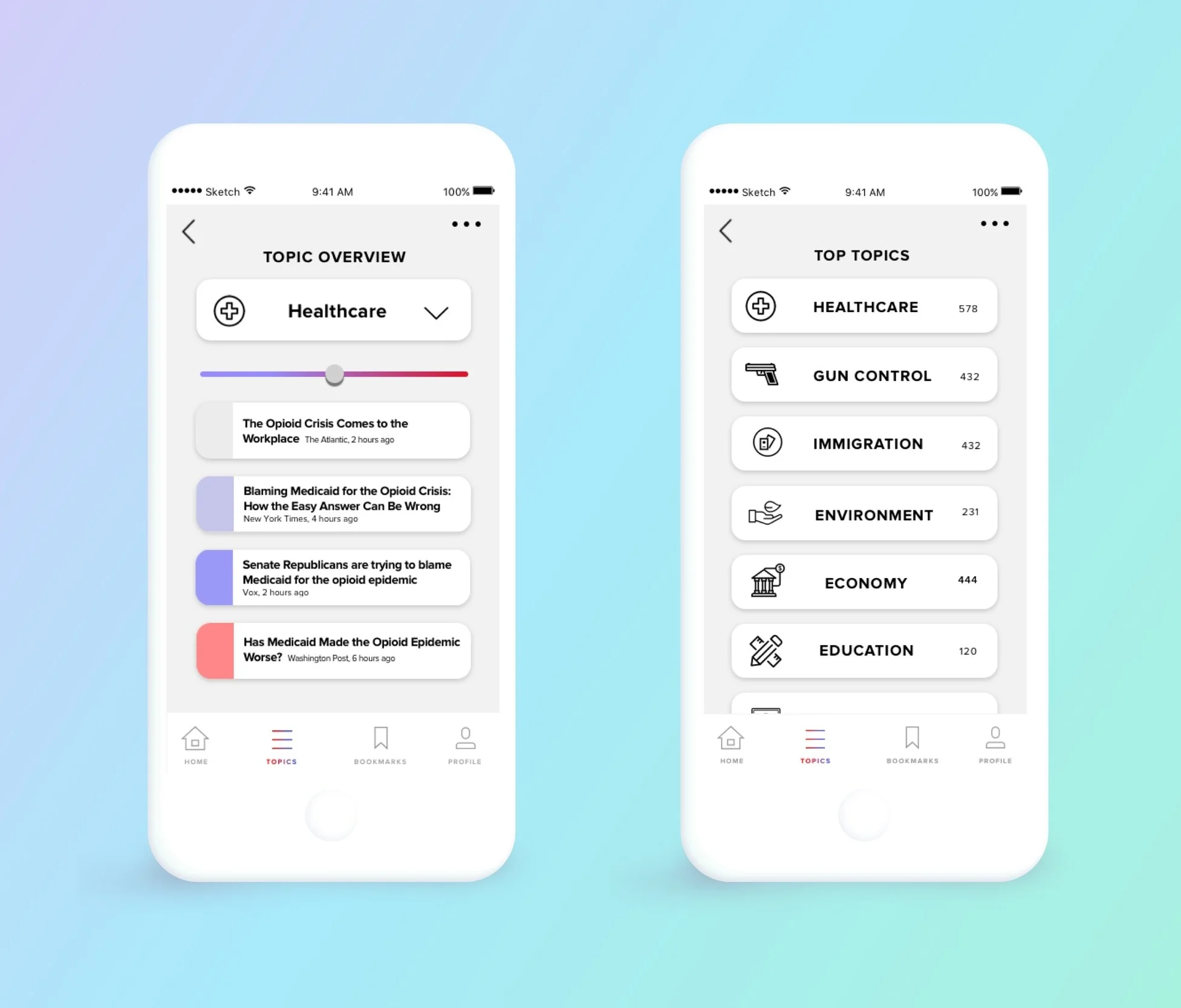
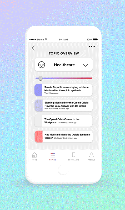
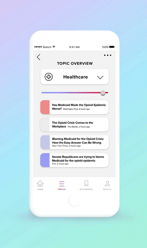
on the Issues
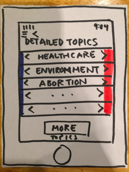
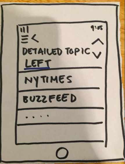
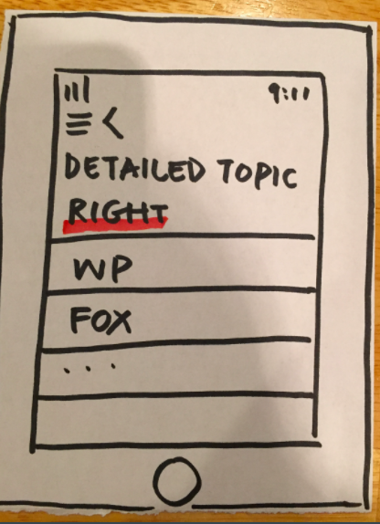
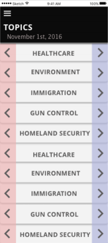
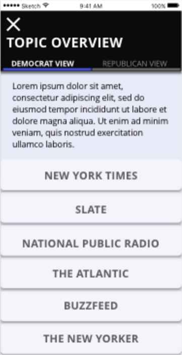
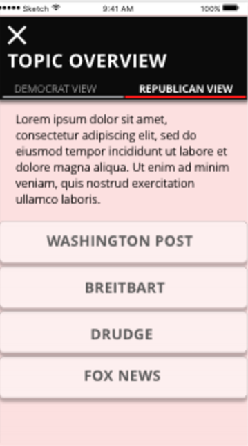
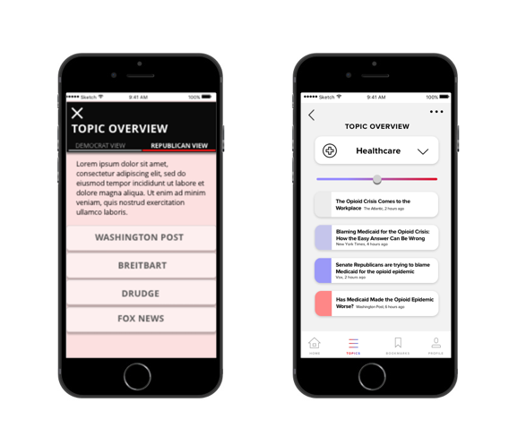
Filter content based on the political issue. The majority of the articles will cover topics that are hotly debated in politics. Examples include healthcare, gun control, and abortion. For users who are not knowledgable about the topic, there will be a quick bipartisan summary of the issue.
The SLIDING TOGGLE
By toggling the dial left and right, you can filter the articles based on the political affiliation of the publication or author. If you pull the dial left, more left leaning, democratic articles will rise to the top of the list. The more right you pull the dial, the more right leaning, Republican articles will show up.
Originally, the interaction was to swipe right or left. However, this approach was too binary. Since the spectrum of political beliefs is more fluid, and there are many more moderate news sources, we accounted for this spectrum by using a sliding toggle.
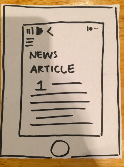
Reading the Articles
Save all the articles that you do not have time to read. Through my research I found that the biggest complaint of my demographic was that they often didn't have time to read articles, especially when on transit.
Articles from different news sources will be read through the app. At the end of every article, the user will be able to determine how much they agree or disagree with the sentiment of the content. This will help the app to understand which politicians the user aligns with, and which would best represent their values.
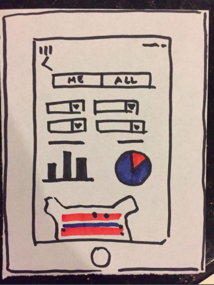
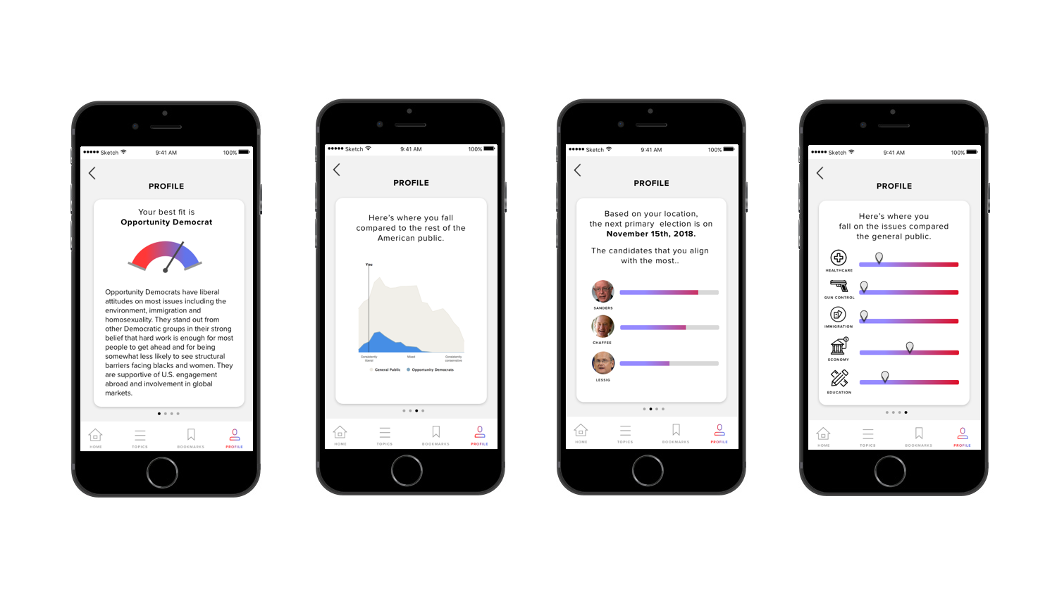
See Where You Stand
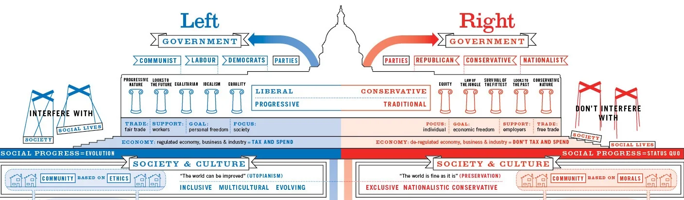
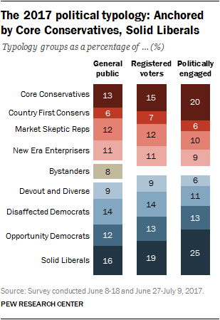
In the profile section, you will be able to see details and how you stack up with others based on your activity in the app. Since the political spectrum can be very fluid, the user will be given a political typology that they fit in the most. These classifications are found from a Pew Research study done on 5,000 American voters.
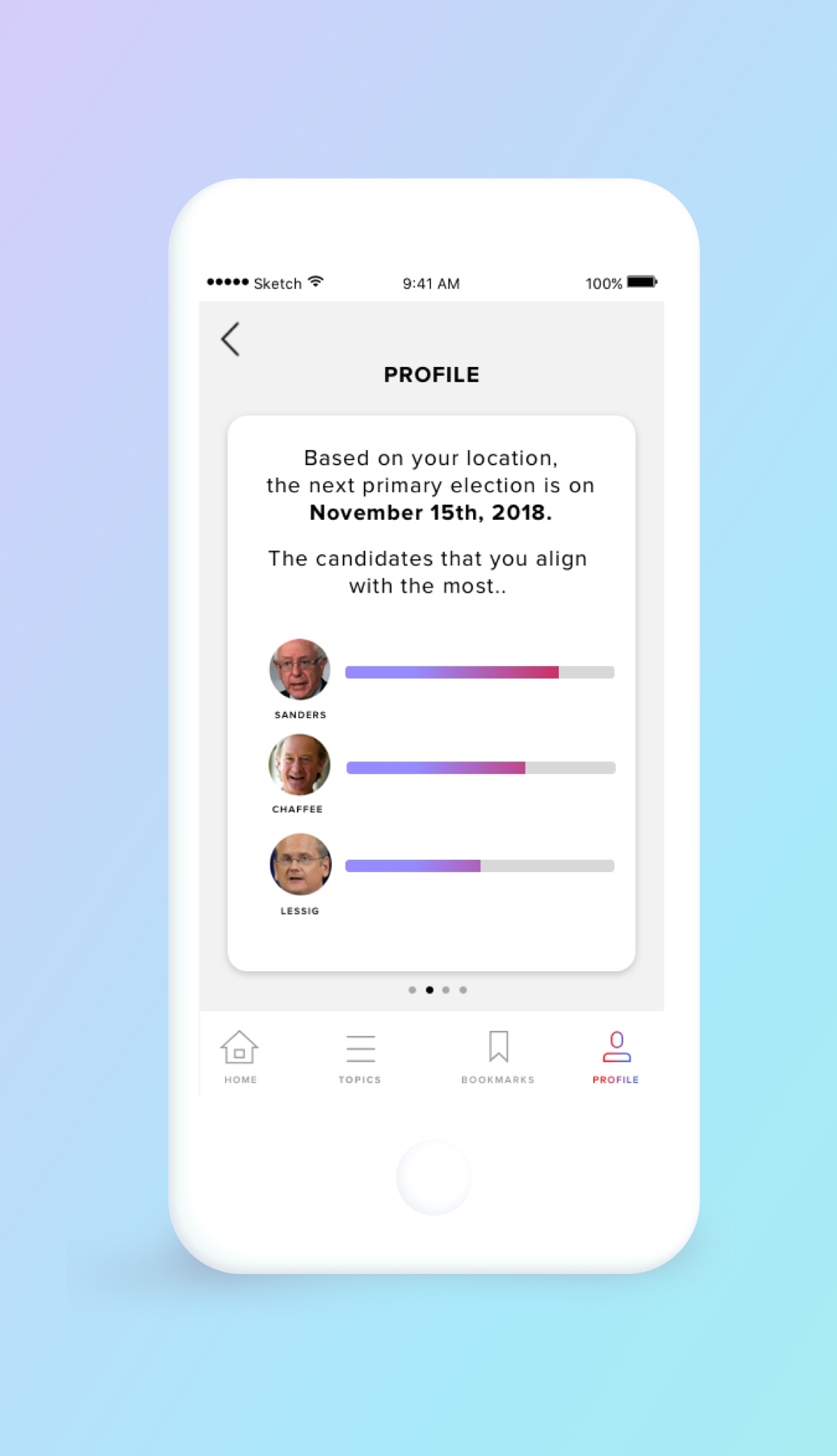
candidate match
During my research, one issue that many of my users faced was being well informed about the stances of the political candidates that were running. This was especially difficult for candidates on the local level. In order to be truly informed voters, the user can see how congressional and local candidates stand more specifically on the issues you care about.
In addition, the app will remind you of the upcoming elections so that the user won't forget to vote.
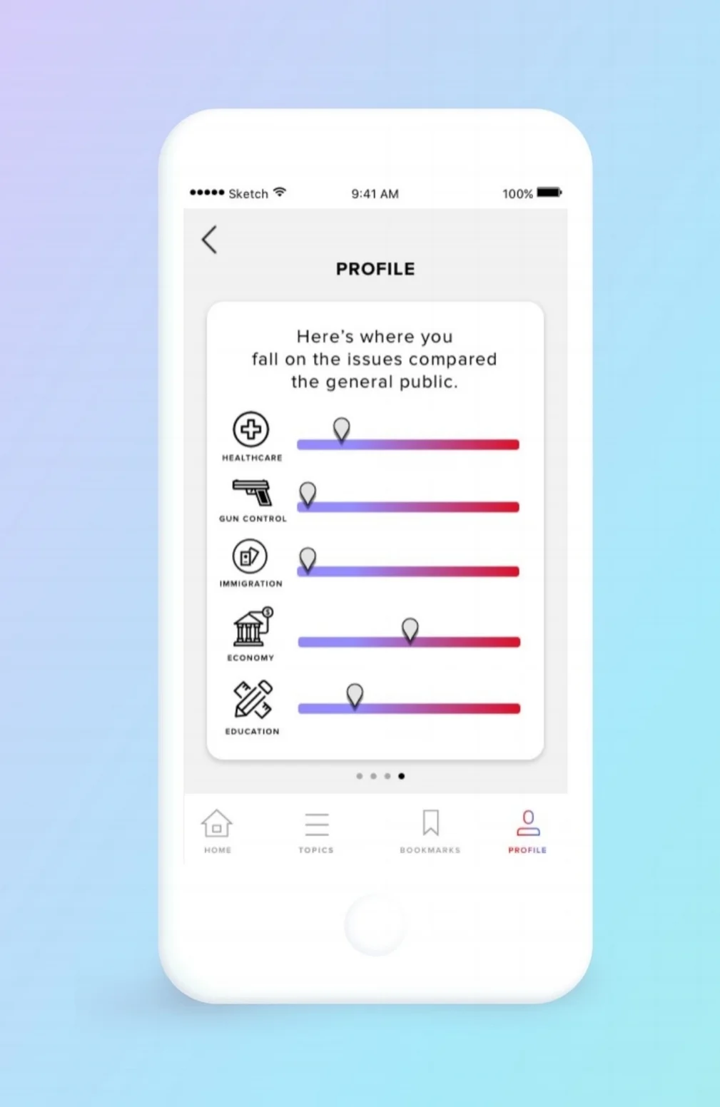
detailed analysis
Users can see a detailed breakdown on how they fall on the specific political topics. This gives a more comprehensive analysis of the users stance on specific issues.
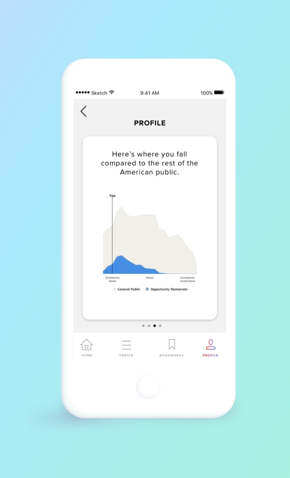
COMPARE TO THE GENERAL PUBLIC
Users will also be able to compare how their political views compare to the general American public. Originally users were given the ability to compare with their social networks. However, many users were uncomfortable with sharing their political leanings with their social networks.
My DESIGN PROCESS
The Problem In Detail
Users tended to seek out information that strengthened their preferred narratives and to reject information that undermined it. Alarmingly, when deliberately false information was introduced into these echo chambers, it was absorbed and viewed as credible as long as it conformed with the primary narrative. - Washington Post
Although confirmation bias is not a new concept, in the age of social media as a source of news, it can be even more augmented. Especially in today's turbulent political climate, it is even more important to read across the aisle and have open discourse with "the other". My belief is that if we can understand why someone's political views do not match with us, it will be easier to empathize with the other side.
Credit: John Huntinghouse
If we unpack this problem into specific user needs, we see that they need to do the following:
Need to read literature on both sides of the major political issues
Need to know what political candidates they align with
Need convenient access to this data quickly and easily
LITERATURE REVIEW
There is a wide range of papers that analyze the effective of confirmation bias. What was particularly interesting was how this bias was augmented and manipulated by social media feeds. The most blatant example is Facebook, which includes many instances of 'fake news', which are claimed to have swung the election of Donald Trump.
A 2015 study suggested that more than 60% of Facebook users are entirely unaware of any curation on Facebook at all, believing instead that every single story from their friends and followed pages appeared in their news feed. - The Guardian
After the first iteration of wireframes, I discovered the Pew Research Center's political typology classifications. The key takeaway from this research was that political affiliation was more nuanced than just conservative and liberal.
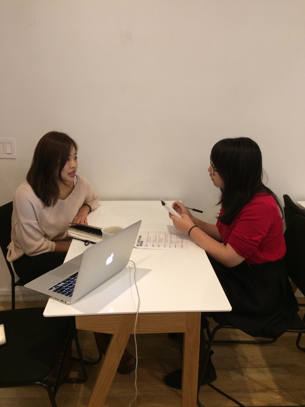
INTERVIEWS
Throughout this project, I conducted interviews with millennial American citizens who were registered to vote. Out of these users, all of them used smart phones, and more than 80% were heavy social media users. Of these interviewees, roughly half of them associated as conservative, while the other half described themselves as liberal.
Key takeaways from these interviews were that these young adults felt there was no reliable source that they could comfortably go to when they read the news. They did not have much time to read the news, and often relied on their social media feeds to get breaking news. Most were not surprised to hear that there were specific Facebook algorithms which influenced their news feeds, however most did not do anything actively to combat this.
COMPETITIVE ANALYSIS
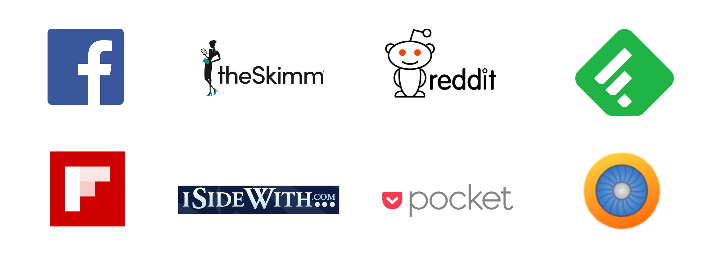
In the competitive analysis, I focused my research on news aggregation applications that are most regularly used. Most of these platforms covered a wide range of articles, not only political news. More interestingly, most of these applications actually curated the news based on what the app's algorithms expected the user to like and agree with. This meant that they were much more likely to be shown information to further affirm their point of view.
The USER
I focused on a user that was a young and on-the-go young millennial American voter. This user is a heavy social media user who does not have a lot of time to sit down and read the news. She is constantly multitasking, has no single source of aggregate news, and wants to be informed and up to date on the current political topics.
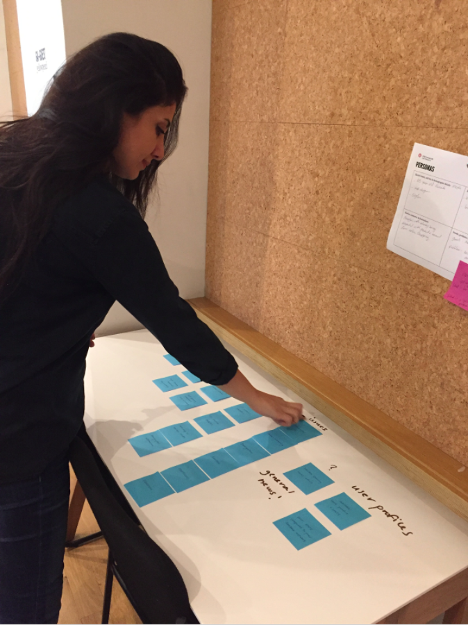
AFFINITY MAPPING
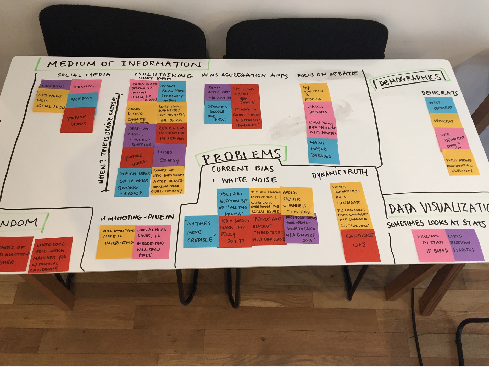
From an observation clustering exercise, we were able to distill several key learnings:
Efficiency, speed, and convenience are necessary for a good political news app.
People tend to look at the news while multitasking (i.e. on the commute to work).
People are more inclined to gather news to affirm their existing bias.
People prefer visual and graphic content over large blocks of text.
People tend to treat those with opposing political views as "the other" and unreasonable.
CARD SORTinG
From our open card sort, I learned that not everyone I interviewed knew what right leaning and left leaning meant, so the labelling and terminology on the app needs to be extremely clear. I'm working under the assumption that my users will have somewhat a working knowledge of the American political system. There was also confusion on where moderate articles might be placed.
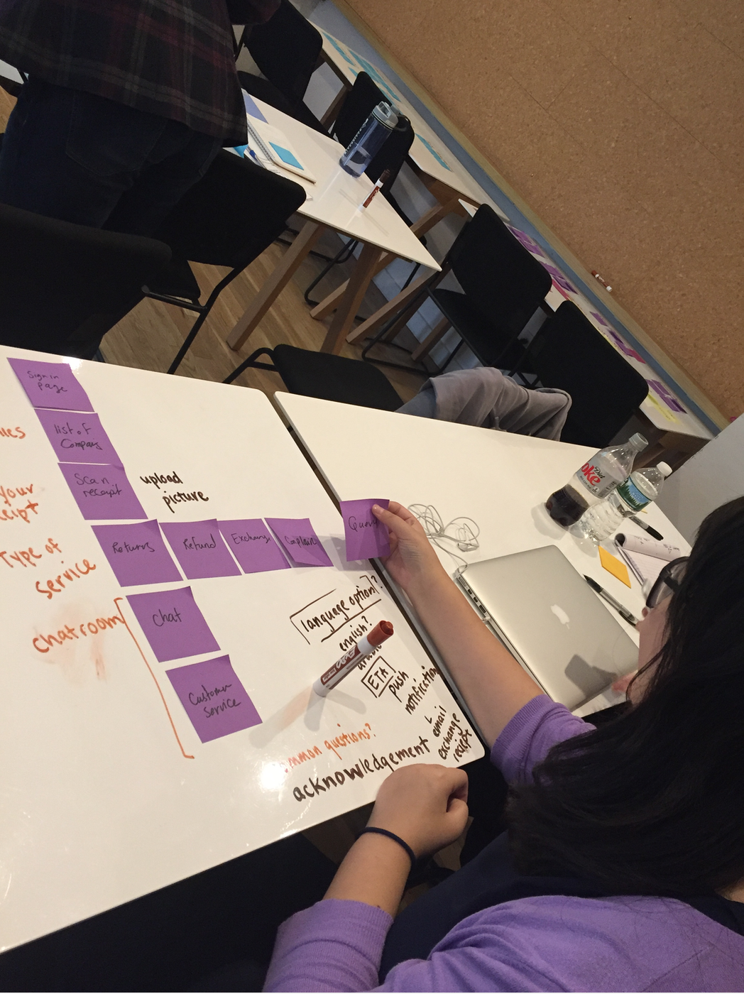
USER FLOW
In the original user flow, the user is prompted by a daily summary of political news. They have the option to drill down into more specific topics, and then consequently read left leaning and right leaning articles which are pertinent to those issues. Based on how they rate the article, the app will assess the political leanings of the user.
sketchING AND IDEATION
INFORMATION ARCHITECTURE
WIREFRAMES
We created the following wireframes to make our ideas more concrete, and to make sure that the Information Architecture made sense.
USABILITY TESTING
In our usability testing, we came across the following issues.
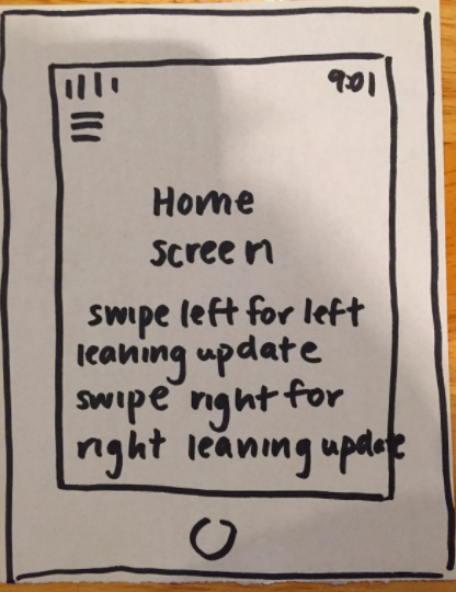
SOLUTION - SLIDING TOGGLE
In order to address this issue, we replaced the swiping left and right for a sliding toggle bar instead. That way, the app can more accurately define the level at which an article is leaning left or right. In addition, this solution gives room for moderate and more bipartisan articles to live within the app.
This toggle's design also made it's way into the rating scale of the articles. Originally, the user could indicate if they strongly agreed or disagreed with an article.
ISSUE 1 - TOPIC TAB TOO BINARY
When asked to navigate to a left leaning article, users were often confused. Many asked if I wanted an article that was more moderate or radical. From this I realized that having things classified as only Republican or Democratic was too binary.
This prompted me to do more user research on political typologies. From this research, I found a classification created by the Pew Research Center which defined the American public into more nuanced political typologies
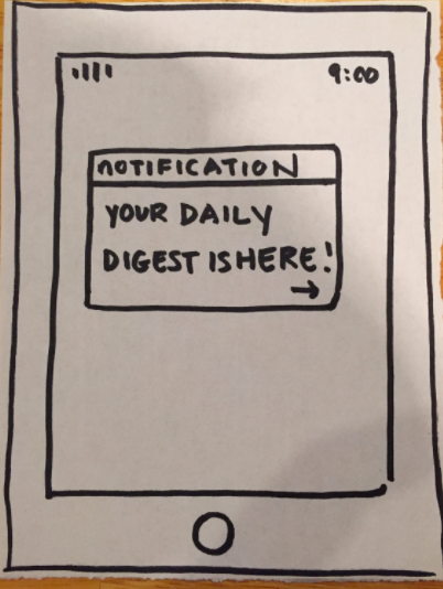
ISSUE 2 - home tab
There was no consensus on what content should be displayed on the home screen. It was difficult to ensure that there was mirroring content on both sides. Additionally, some interviewees who associated as conservative commented about the placement of the summaries. It would be difficult to put one summary over the other while keeping the application unbiased.
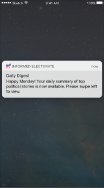
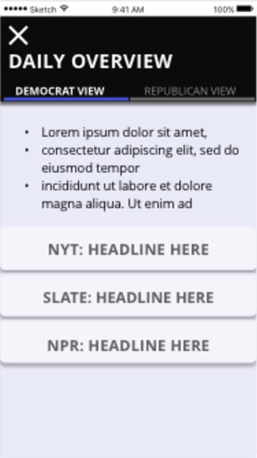
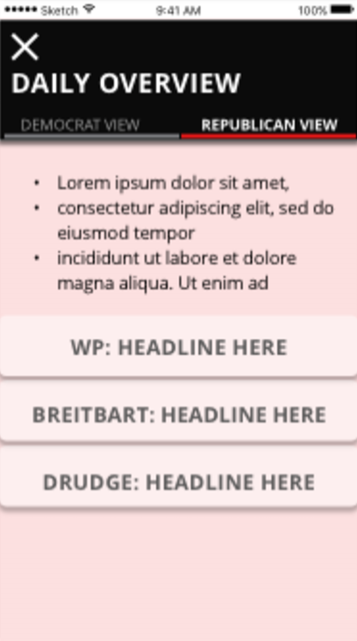
SOLUTION - NO DAILY DIGEST
I decided to remove the digest function all together. Instead of a summary, the user will just be recommended the top trending news articles, making sure that there is a healthy mix of articles. This way, there were less interactions and clicks necessary to get to the content itself.
Solution - No Comparison to Social Networks
We removed the functionality to compare your profile with your social networks. Instead you can compare to the general American public or to your state or district.
ISSUE 3 - profile tab
When asked to share their profile with their friends, many users were uncomfortable with having their political affiliations open to their social networks.
ISSUE 4 - COLOR SELECTION
Because so much of the application is reliant on colors to indicate the political leaning of the content being shown, there was a limit in the colors that could be used in the app.
SOLUTION
I decided upon a minimalistic interface, which uses mostly neutral colors. That way the red and blue colors would stand out, indicating if the content was right or left leaning. However, taking accessibility into mind, I am still working on a solution that does not rely so heavily on color.
NEXT STEPS & LEARNINGS
In terms of next steps, I would like to focus on the accessibility considerations of my application, as well as the logistics of how to classify articles. Initially, I would like to classify the articles by the publication that they come from. However, this may not be entirely accurate. For example, there are some opinion pieces that may not fall under the right category.
From this project, I was really able to learn how to be mindful about accessibility considerations, as well as be more thoughtful about friction and why I receive certain types of user feedback.